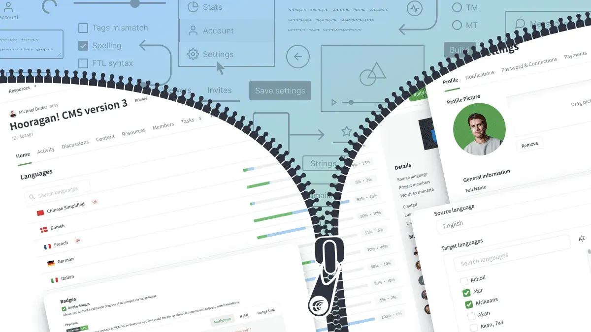
Redesigns are difficult yet inevitable. If you’ve been to your Crowdin project or profile recently, you should have noticed some changes. Here’s a quick look at what’s new, why we’re changing it up, and a bit of “behind the scenes” for you.
Reasons Crowdin Redesigned its Product
When it comes to designing Crowdin products, we’ve always wanted a combination of appealing look and functionality. We wanted to make sure Crowdin looked modern and felt easy to use, with the right combination of efficiency and straightforward UX included.
This refresh has included tasks that were several months in the making. A lot of hours have been invested in crafting, designing, questioning, reviewing, and finally launching our new and improved design.
Here are some main reasons why did we decide to redesign Crowdin:
- Fresher, brighter look
- Readability we achieved with new shades of text, buttons and background
- Improved product usability for our customers
Refreshed Crowdin Pages to Explore
As you can see, our website and knowledge base remained unchanged. New product pages we rolled out include:
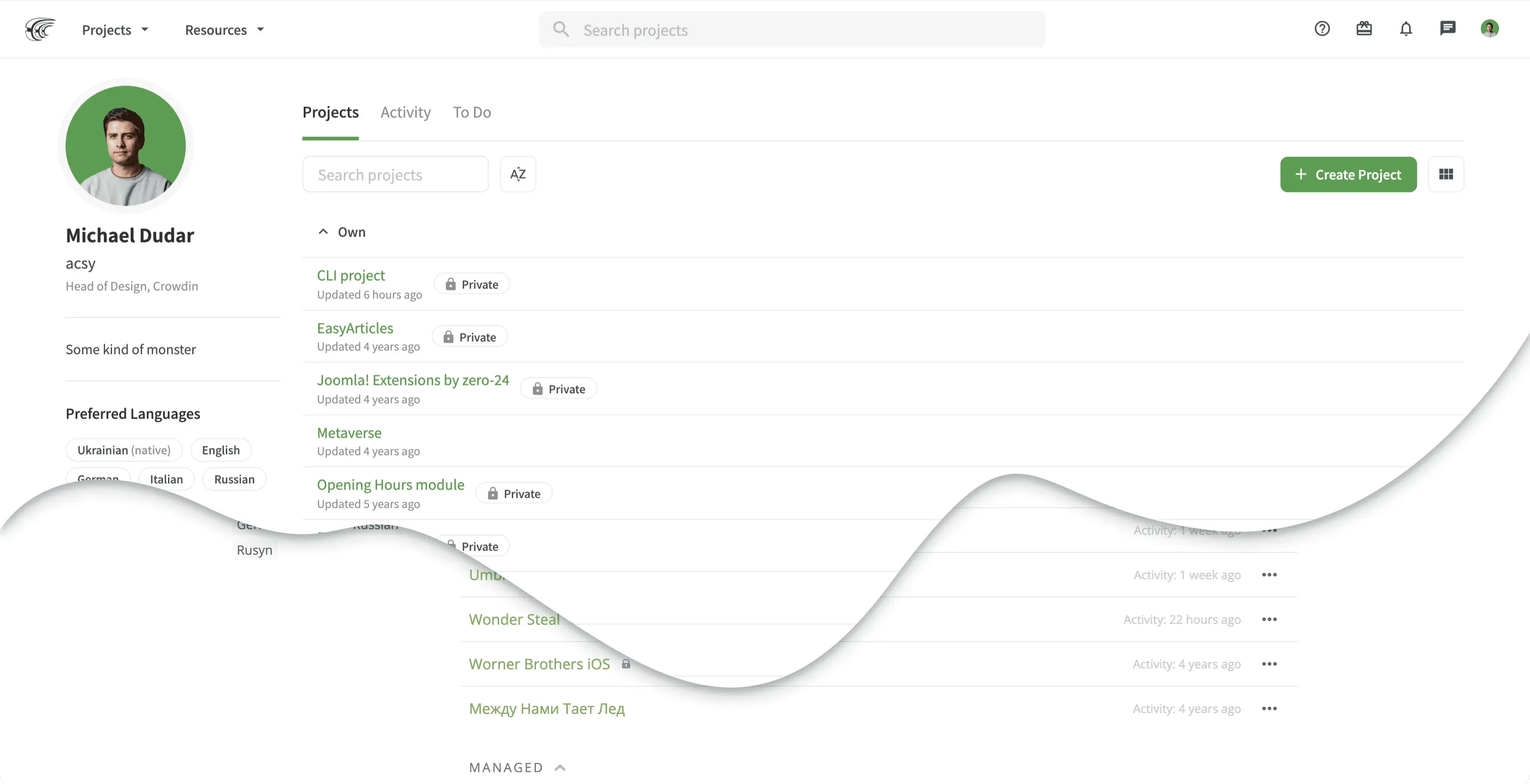
Profile: Home Page
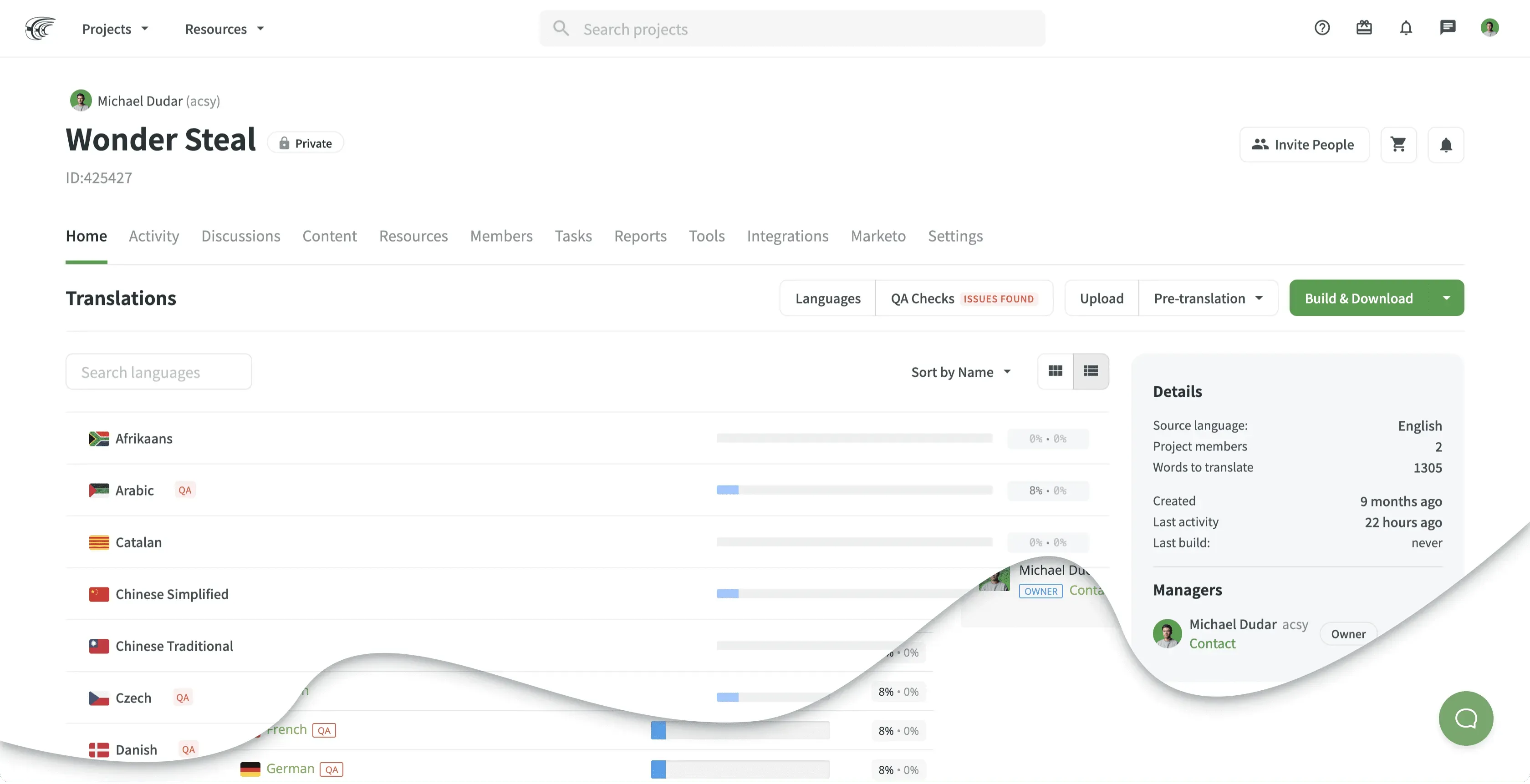
Project: Home Page
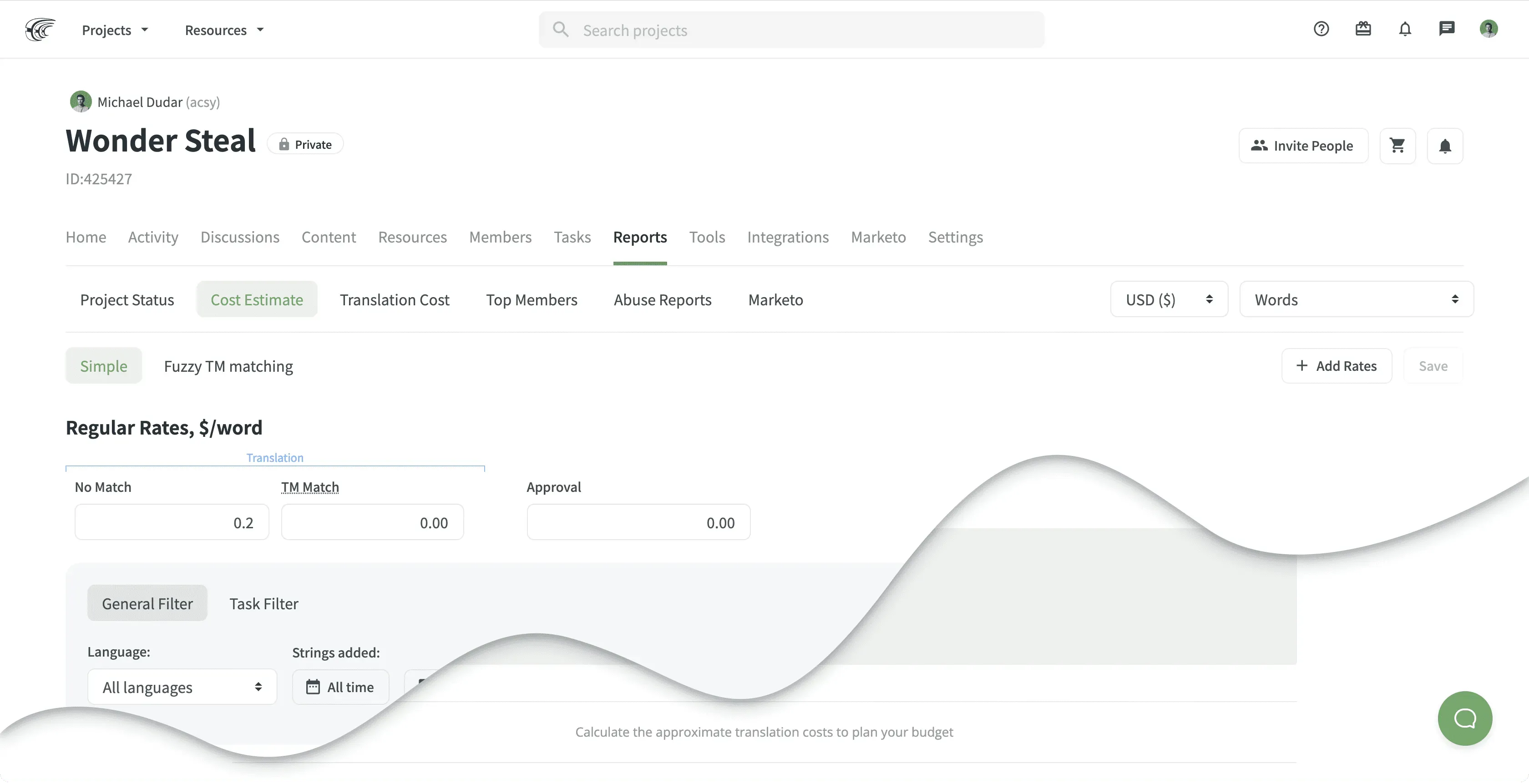
Reports Page: Cost Estimate
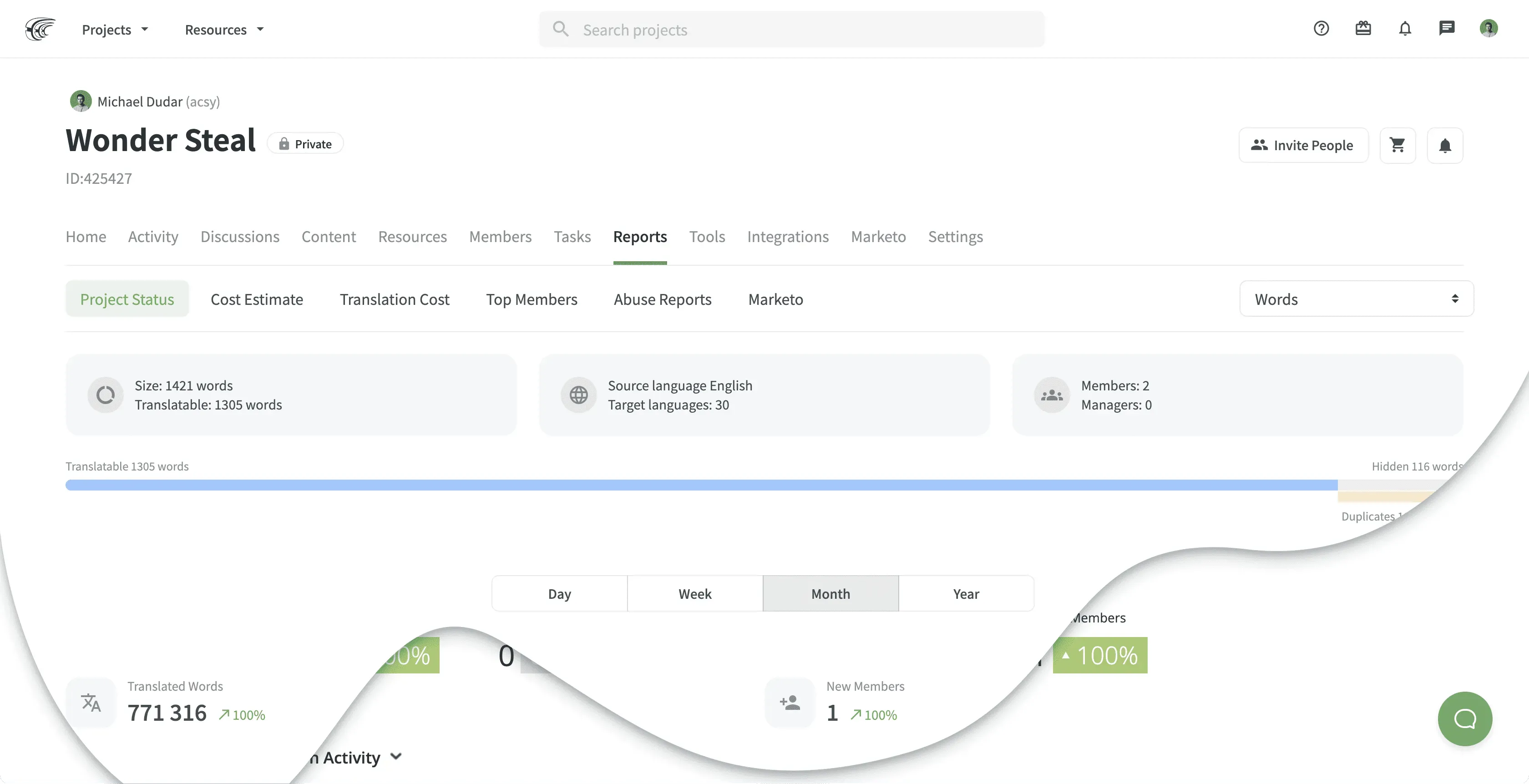
Reports Page: Project Status
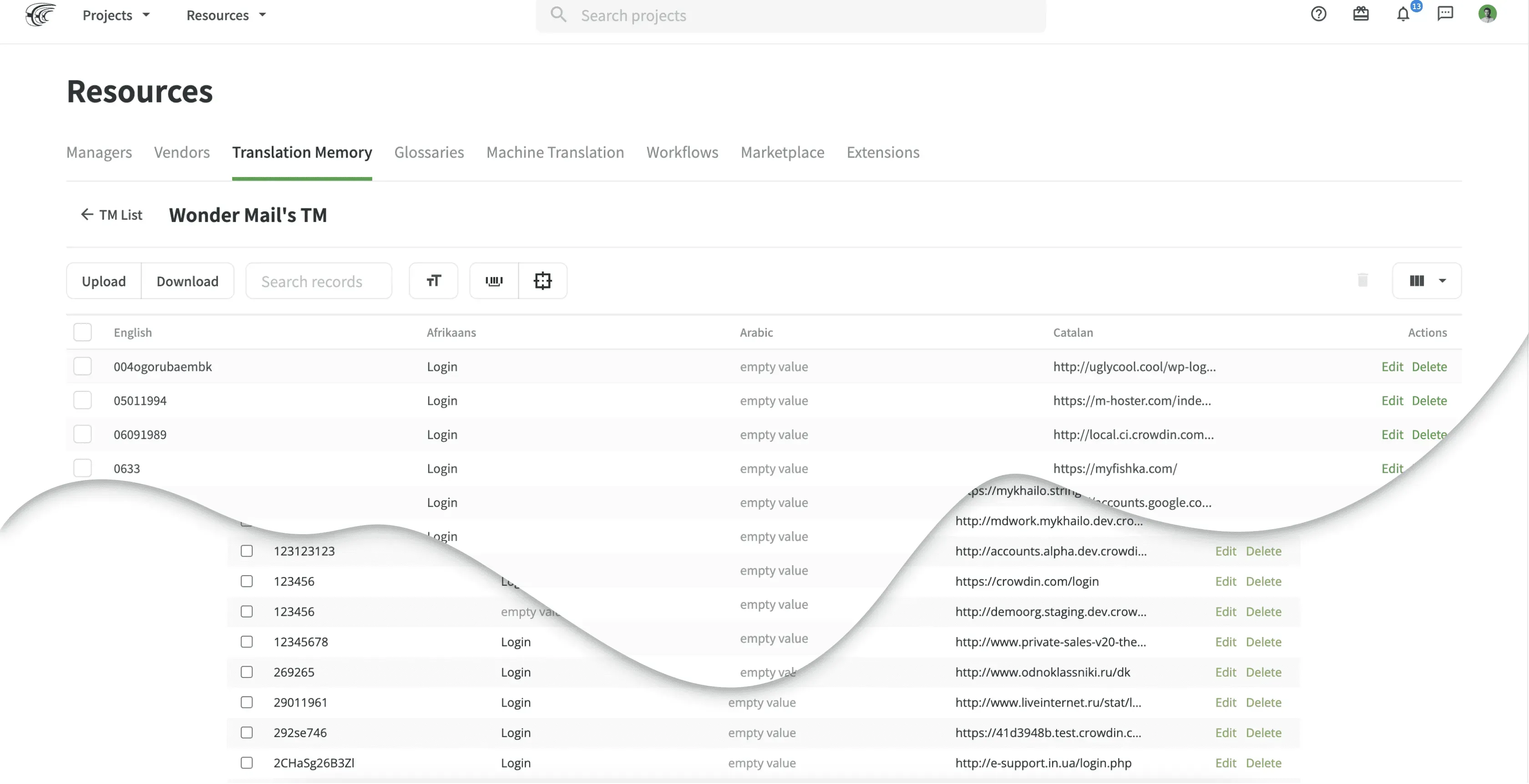
Resources Page
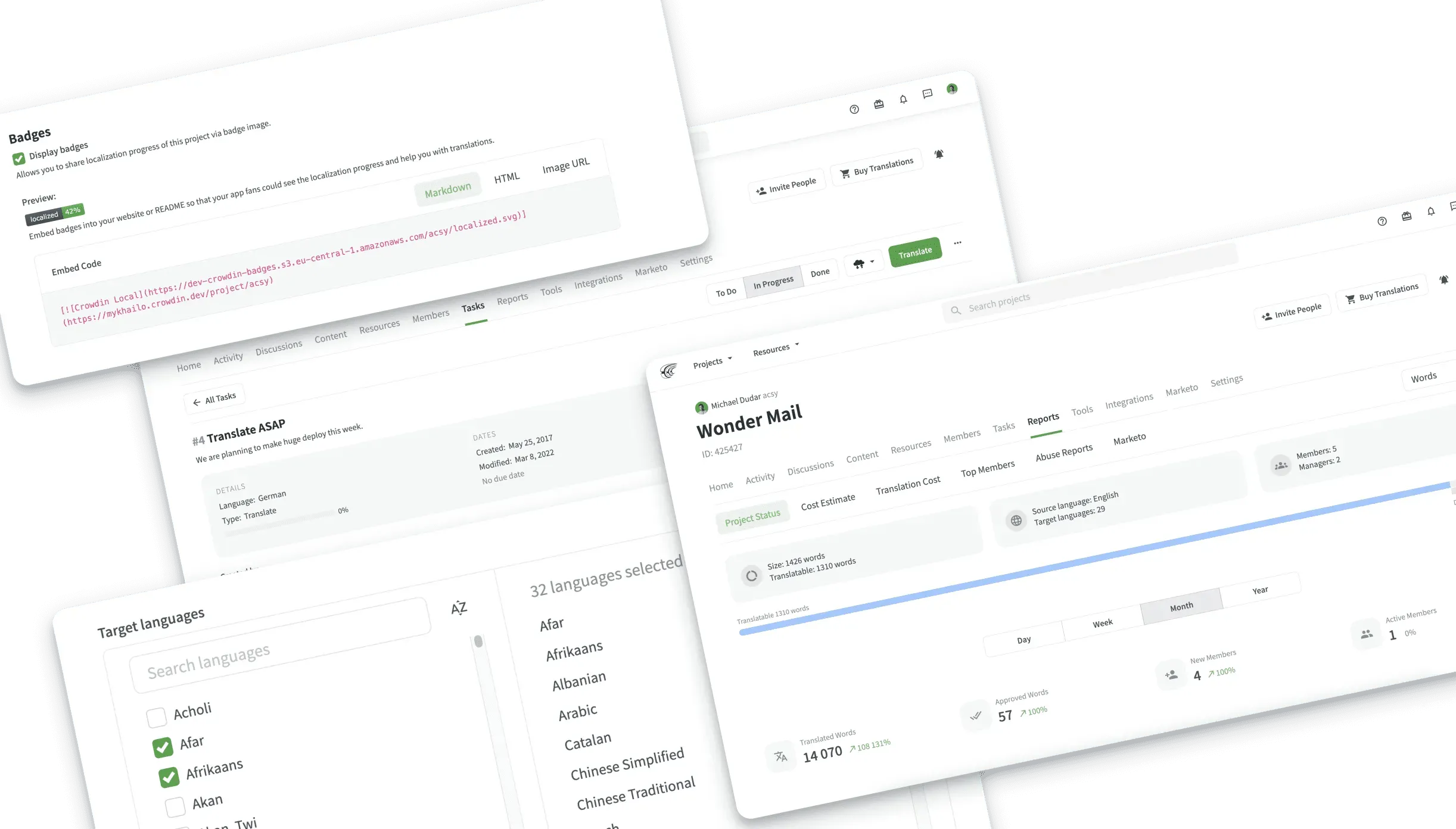
And More Views
Thoughts About New Design
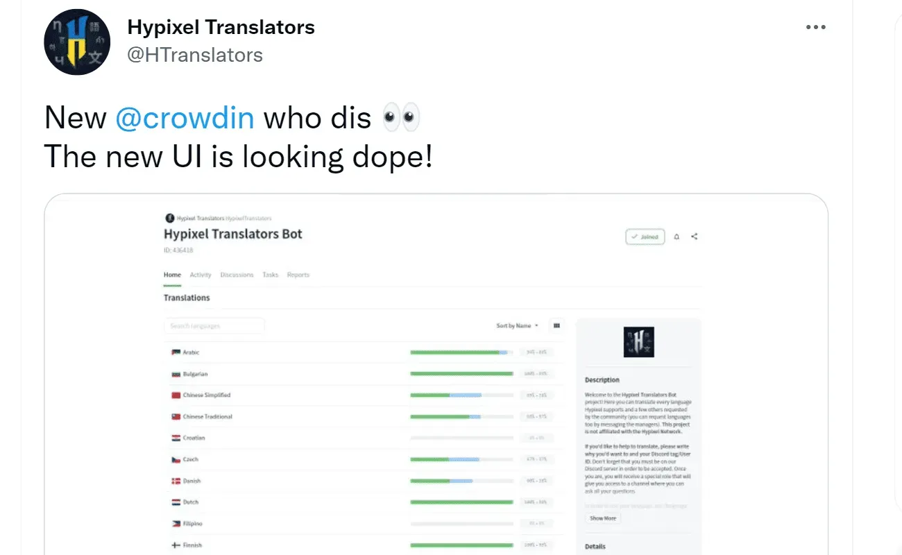
Did we succeed? It’s still early – the new design has been live for less than a month – so results are inconclusive. But our team loves the new look, and so do our users:
It’s been a joy to work on this part of refreshments, the new features and improvements will keep coming. Take a look around and let us know what you think of the new design via chat or email us at support@crowdin.com.
Localize your product with Crowdin
Diana Voroniak
Diana Voroniak has been in the localization industry for over 4 years and currently leads a marketing team at Crowdin. She brings a unique perspective to the localization with her background as a translator. Her professional focus is on driving strategic growth through content, SEO, partnerships, and international events. She celebrates milestones, redesigns platforms, and spoils her dog and cat.
